From this section, we are going to learn about the most popular Stock Charts Pattern step by step, and at the end of this section, I will provide you with a Chart Patterns PDF (Free Download 2024).

We will learn about:
Double Top Pattern
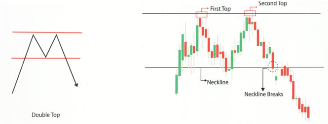
A Double Top is like a warning signal for investors. It happens when something like a stock or cryptocurrency price hits a high two times in a row and with a little drop in between. When the price falls below a certain point it is called the support level, that’s when you should know that the double top is for real, and it suggests the price might keep going down.
Double Bottom Pattern

A Double Bottom is a super positive signal in trading. It happens when something like a stock hits a low price two times consecutively with a little bit of support in between. When the price goes above a certain level it is known as the resistance level, which is usually around the highest point between the two lows then it confirms that it is a double bottom pattern. This is seen as a strong signal that the price will keep going up.
Triple Top Pattern

A Triple Top pattern is a bad signal in trading. It happens when the stock price hits a high price three times in a row with a little drop in between each high. When the price falls below a certain level it is known as the support level, which is usually around the lowest point between the three highs then it confirms it is a triple top pattern. This suggests that the price might keep going down.
Triple Bottom Pattern

A triple bottom is a good signal in trading. It happens when something a stock hits a low price three times in a row and with a little support in between each low. When the price goes above a certain level it is known as the resistance level, which is usually around the highest point between the three lows it confirms the triple bottom pattern. This suggests that the price might keep going up.
Head & Shoulder Pattern
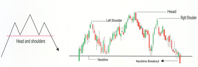
A head and shoulders pattern is a shape on a chart that looks like three bumps. The two bumps on the outside are about the same height and the one in the middle is the tallest. When the price drops below a certain point it is called the support level and it confirms the pattern. It’s called “head and shoulders” because it kind of looks like a person’s head and shoulders on the chart.
Inverse Head and Shoulder Pattern

An inverse head and shoulders are like the flipped version of the regular head and shoulders pattern. It is used to predict when a downtrend might turn around and start going up. Instead of bumps, it looks like three dips on a chart. First, the price goes down to a low point, then it goes up a bit, then down again but not as much as before. When it goes up after the last dip and breaks a certain point it is called resistance, that’s a signal that the price might start going up for real.
Rising Wedge Pattern

The rising wedge is a pattern on a chart that might mean the trend is about to change. It looks like two lines coming together with the price going up in between them. Usually, the trading volume gets lower as this happens. When the price breaks below the lower line it confirms that the price might start going down.
Failing Wedge Pattern

The falling wedge pattern is a shape on a chart that happens when the market keeps going down, making lower lows and lower highs, but within a smaller range each time. If this happens during a period of falling prices, it suggests a possible turnaround. We confirm the breakout when the price breaks above a certain line and starts going up.
Bullish Rectangle Pattern

The bullish rectangle is a pattern on the chart that happens when the price takes a break during a strong trend. It moves back and forth between two parallel lines for a while before the trend starts. We know the breakout is happening when the price breaks above a certain level and starts going up again.
Bearish Rectangle Pattern
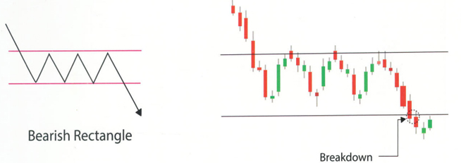
The bearish rectangle is a pattern on the chart that happens when the price takes a break during a strong downward trend. It moves back and forth between two parallel lines for a while before the trend continues downward. We confirm the breakout when the price breaks below a certain level and starts going down again.
Bullish Flag Pattern

Bullish flag formations are seen in stocks that are on a strong upward trend, and they’re seen as positive signs that the trend will continue. They’re called bull flags because they look like flags on a pole. The pole happens when the price shoots up quickly on the chart, and then the flag part comes from a period where it consolidates or holds steady. We confirm the breakout when the price moves above the top of the flag.
Bearish Flag Pattern

The bearish flag is the opposite of the bull flag. It looks the same but flipped upside down. It starts with a steep drop in price caused by a sudden rush of selling followed by a bounce where the price moves within parallel lines and forms the flag shape. We confirm the breakout when the price falls below the bottom trendline.
Bullish Symmetrical Triangle Pattern
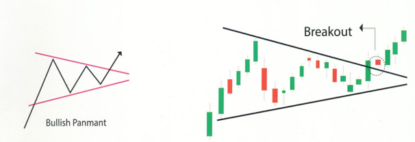
A bullish symmetrical triangle is a pattern on the chart that suggests the continuation of an upward trend. It forms when two trend lines converge symmetrically towards a horizontal line. The upper trend line acts as resistance, indicating a level where the price struggles to move higher. We confirm the breakout when the price moves above this resistance line and starts going up.
Bearish Symmetrical Pattern

A bearish symmetrical triangle is a pattern on a chart indicating a continuation of a downward trend. It’s formed by two converging trend lines that meet at a horizontal line. The lower trend line acts as support, suggesting a level where the price finds it hard to drop below. We confirm the breakout when the price falls below this support line and starts moving downward.
Cup and Handle Pattern
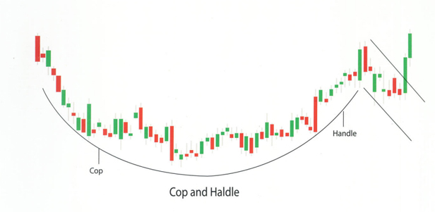
A cup and handle is a pattern that looks like a teacup followed by a downward movement resembling a handle. This handle is seen as a buying opportunity for the stock. We confirm the breakout when the price moves above a certain level called the neckline or resistance, indicating a potential upward movement.
Inverted Cup and Handle Pattern
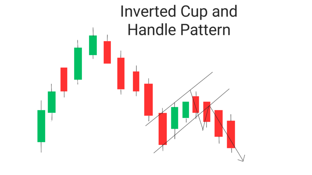
The inverted cup and handle pattern forms an upside-down cup and handle. The pattern is formed after a pullback from a swing low before a sell-off to the prior swing low and stalls due to underlying support. The stock then stalls much like a bear flag with slight upward pressure before breaking down below support.
Ascending Triangle

The pattern is formed like a right-angled triangle with a resistance line and a trendline of higher lows. The resistance line stops the chart from moving upward while the higher lows indicate increasing buying pressure. This pattern suggests that the market is likely to move higher as it forms higher lows heading towards the resistance line. It’s important to note that the breakout can occur in either direction.
Descending Triangle

This pattern occurs during a downtrend and suggests that the downtrend will continue. It’s formed as a downward-sloping triangle with a support line and a series of lower highs. The support line prevents the chart from dropping further while the lower highs indicate increasing selling pressure. This pattern shows that the market is likely to keep moving lower as it forms lower highs heading toward the support line. Importantly, the breakout can happen in either direction.
Click on the download link below to download Chart Patterns PDF (free download)


